
Color theory is a body of knowledge with which an artist turns
characters
into life. Knowing how to wield the power of color can make or break your
character designs
,
whether you are a seasoned professional or just dipping your toes in the ocean of animation. Now let’s dive our thoughts into the overwhelming, vibrant world of color theory and how it will radically enhance our animations.
Why Color is More Than Just Eye Candy?
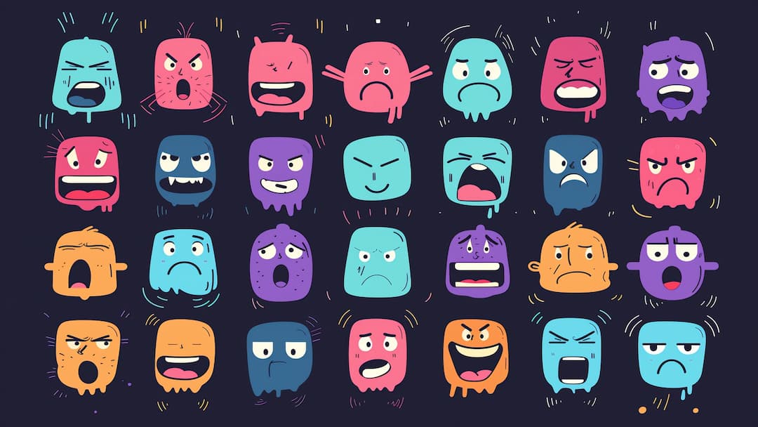
- Red: Passion, anger, energy
- Blue: Calm, trust, intelligence
- Yellow: Happiness, optimism, caution
- Green: Nature, growth, envy
- Purple: Royalty, mystery, creativity
- Orange: Enthusiasm, adventure, confidence
- Pink: Love, femininity, playfulness
- Brown: Earthiness, reliability, comfort
- Black: Power, elegance, evil
- White: Purity, innocence, cleanliness
The Color Wheel: Your New Best Friend
If you haven’t by now, it’s time to get familiar with the color wheel. This handy little tool is the basis of color theory and will help you navigate combining colors in your characters.

Understanding Color Wheel:
-
Structure:
- It's a circular diagram divided into 12 segments.
- The segments are arranged in a spectral order, transitioning smoothly from one color to the next.
-
Color Categories:
- Primary Colors: Red, Yellow, and Blue
- Secondary Colors: Orange, Green, and Purple
- Tertiary Colors: Red-Purple, Orange-Red, Yellow-Orange, Yellow-Green, Blue-Green, and Blue-Purple
-
Labeling:
- Each segment is labeled with both the color name and its category (Primary, Secondary, or Tertiary).
-
Center:
- Center of the wheel contains two curved arrows and text indicating “Warm” and “Cool” color ranges.
-
Color Distribution:
- Warm colors (reds, oranges, yellows) are on the right side.
- Cool colors (greens, blues, purples) are on the left side.
-
Purpose:
- This wheel is designed as an educational tool to illustrate color theory concepts.
- It shows the relationships between different colors and how they're categorized.
This type of color wheel is commonly used in art, design, and color theory education to teach about color relationships, harmonies, and mixing.
Classic Color-Combinations
Here are some of the classic color combinations to get you started:
Complementary Colors:
Complementary colors are opposites on the color wheel. They are located directly across from each other on the color wheel, separated by 180 degrees.
Primary-Secondary complementary pairs:
- Red and Green
- Blue and Orange
- Yellow and Purple

While the color wheel above doesn't specifically highlight complementary pairs, understanding their relationship on any color wheel is fundamental to color theory and practical application in various visual arts and design fields.
Analogous colors:
Analogous colors in a color wheel are groups of colors that are adjacent to each other on the wheel. These are groups of three to five colors that are next to each other on the color wheel. They appear side by side, creating a harmonious and smooth transition from one color to the next. Their composition typically includes one dominant color (often a primary or secondary color), one or two supporting colors, and sometimes a third color that acts as an accent.
Examples from the wheel above:
Examples from the wheel above:
- Red, Red-Purple, and Purple
- Blue, Blue-Green, and Green
- Yellow, Yellow-Orange, and Orange
Read Also: WHAT IS AN ANALOGOUS COLOR SCHEME, AND WHY ARE DESIGNERS SO OBSESSED? BY LUCIA TONELLI
Characteristics:
- Create a serene and comfortable visual effect
- Share similar undertones, making them naturally harmonious
- Often found in nature (e.g., autumn leaves transitioning from green to yellow to orange)
Color harmony:
Analogous color schemes are considered to be pleasing to the eye and create a sense of cohesion in designs.
Usage in design:
- Often used to create a unified and balanced look in visual compositions
- Can create a sense of depth or movement when arranged from lighter to darker shades
- Useful in creating gradients or subtle color transitions
Applications:
Commonly used in graphic design, interior design, fashion, and art to create cohesive and visually appealing color schemes.
Read Also: The Importance of Colour Harmony By BRIONY-MOLLY
Read Also: The Importance of Colour Harmony By BRIONY-MOLLY
Contrast consideration:
When using analogous colors, it's important to ensure there's enough contrast for readability and visual interest, especially in designs requiring text or distinct elements.
While the color wheel above doesn't specifically group or label analogous colors, understanding their relationship with any color wheel is important for creating harmonious color schemes in various visual arts and design applications.
While the color wheel above doesn't specifically group or label analogous colors, understanding their relationship with any color wheel is important for creating harmonious color schemes in various visual arts and design applications.

Triadic colors:
Three colors equally spaced on the wheel—for instance, red, yellow, and blue. This color scheme is known for creating visual harmony and vibrant contrast, making it a popular choice in art and design.
Benefits of Using Triadic Colors:
- Balanced Contrast: Triadic schemes offer a high level of contrast while maintaining balance, avoiding the overwhelming effect that complementary color pairs might have.
- Versatility: These colors can work well together in various designs, from vibrant and dynamic to subdued and harmonious, depending on their saturation and brightness.
- Visual Interest: The use of three different hues adds depth and interest to the design, making it visually appealing.
Using Triadic Colors in Design:
- Primary Colors: The most well-known triadic scheme is the primary colors: red, yellow, and blue. This combination is often used in children's products and playful designs due to its bright and cheerful appearance.
- Secondary Colors: Another example is the secondary colors: orange, green, and purple. This scheme can create a more sophisticated and balanced look.
- Adjusting Intensity: Designers often tweak the intensity and saturation of triadic colors to suit their needs. For instance, using muted shades of triadic colors can create a more subtle and harmonious effect.
Application Tips:
- Dominant Color: Choose one of the triadic colors as the dominant hue and use the other two as accents.
- Balance: Ensure that the use of the three colors is balanced to avoid clashing.
- Test and Adjust: Experiment with different shades and tints to find the perfect balance for your design.
Examples in Nature and Culture:
- Nature: Triadic color schemes are commonly found in nature, such as in flowers, birds, and landscapes, offering inspiration for harmonious color combinations.

- Art: Many famous artworks use triadic colors to achieve visual harmony and dynamic contrast, demonstrating the timeless appeal of this scheme.
Triadic colors provide a versatile and balanced approach to color selection, making them a favorite among artists and designers for creating visually appealing and harmonious compositions.
Read Also: What is a Triadic Color Scheme — Definition and Examples BY SAM KENCH for StudioBinder
Split-complementary colors:
Split-complementary colors are a color harmony scheme derived from the color wheel. While they aren't explicitly shown in the image of color wheel, I can explain how they work based on the standard color wheel concept:
Definition:
Split-complementary colors consist of one base color and two colors adjacent to its complement on the color wheel.
How to find them:
Choose a base color on the wheel.
Identify its complement (the color directly opposite on the wheel).
Instead of using the direct complement, use the two colors on either side of the complement.
Example:
If red is the base color:
Its complement would be green.
The split-complementary colors would be yellow-green and blue-green.
Identify its complement (the color directly opposite on the wheel).
Instead of using the direct complement, use the two colors on either side of the complement.
Example:
If red is the base color:
Its complement would be green.
The split-complementary colors would be yellow-green and blue-green.
Characteristics:
This scheme provides high contrast similar to complementary colors, but with less tension.
It's more balanced and easier to use effectively than pure complementary colors.
It's more balanced and easier to use effectively than pure complementary colors.
Usage in design:
Often used to create vibrant, visually interesting color schemes.
Provides a good balance of contrast and harmony.
Provides a good balance of contrast and harmony.
On the wheel:
While not marked on the provided wheel, you can visualize it by choosing any color and then selecting the two colors that are one step away from its opposite.
Advantages:
It's more sophisticated than a complementary scheme.
It offers more variety while still being harmonious.
It offers more variety while still being harmonious.
Challenges:
Can be tricky to balance, especially with pure hues.
Often, it works best when one color dominates and the others are used as accents.
While the specific split-complementary relationships aren't labeled on the color wheel in the image, understanding the wheel's structure allows designers and artists to easily identify and use this color harmony scheme in their work.
Read Also Simplifying Color Choice with Split Complementary Color Schemes By Etchr Lab

Play with these combinations to come out with really striking characters. At the same time, never be scared of breaking this rule-indeed, really memorable characters are usually those that come from apparently odd color choices.
Advanced Color Techniques: Beyond the Basics
Now that you have grasped the basics, it’s time to take your color skills to the next level. Here are some advanced techniques that can take your character designs from good to great:
The Power of Saturation:
Saturation is the measure of saturation within a hue. More saturated colors are bright and stimulating; the more desaturated, the more subtle and muted. This creates depth and visual interest with an added saturation contrast to your character design.
For example, you can have those features that are really key—things like hair or clothing—done in very saturated colors, and then have less important elements in more muted tones. This approach guides the viewer’s eye and puts emphasis on what is most important.
For example, you can have those features that are really key—things like hair or clothing—done in very saturated colors, and then have less important elements in more muted tones. This approach guides the viewer’s eye and puts emphasis on what is most important.

Temperature Tells a Story:
Colors are usually divided into “warm”—red, orange, and yellow—and “cool”—blues, greens, and purples. The temperature of your color palette is something that can really alter the mood and personality of your character.
A warm-colored character conveys easiness, energy, and passion; a cool-colored one speaks of calm, intelligence, or sadness. Mixing temperatures creates interesting contrasts—consider the “cool” person who has a secret passion expressed by a pop of warm color.
The Nuance of Neutrals:
Don’t sell short on the strength of neutrals like black, white, gray, or brown. These unsung heroes of the color world can do the following:
- Balance out more vibrant hues
- Create sophisticated, mature looks
- Serve as a canvas for pops of color
- Convey specific character traits, like reliability or mystery

Clever use of neutrals will help shift your character designs from cartoonish to complex.
Cultural Considerations: Colors Across Borders:
Color Associations Vary Across Cultures In the globalized world today, it is imperative to keep in mind that color associations vary greatly among cultures. Something that works in one part of the world may just fall flat or worse off in another area. Here’s a fast guide to some cultural color considerations:
Color Interpretations
| Color | Western Interpretation | Eastern Interpretation |
|---|---|---|
| Red | Danger, passion | Good luck, prosperity |
| White | Purity, weddings | Mourning, funerals |
| Green | Nature, go, money | Infidelity (China) |
| Purple | Royalty, luxury | Mourning (Thailand) |

It’s good to do a little homework on color meanings in different cultures when you’re designing characters for an international audience. The knowledge can help you create universal characters or, if needed, tailor your designs for specific markets.
Read also: Mastering Color Theory: Advanced Color Theory Insights By Geeks For Geeks
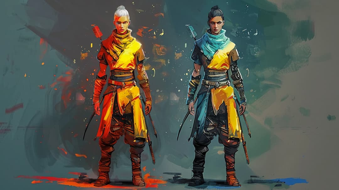
Bringing It All Together: Color in Action
Now, to see how all of these
principles
work in action in
character design
,
let’s look at some color choices I recently made while working on a character; she’s a teenage, tech-savvy superhero.
Base Color:
Dark purple acts as a central color for Zara. Purple combines the balancing effects of blue with the energizing effect of red—a perfect perspective for a heroine who balances intellect and action courses. It also has connotations of royalty and magic, foreshadowing Zara’s special powers.
Accent Colors:
To complement the purple we used:
Electric Blue—on her mechanized devices, in order to convey newness, advanced technology
Bright Yellow—for miscellaneous areas, to add energy that is young
Subtle gray—for the costume’s neutral areas, grounding it
Bright Yellow—for miscellaneous areas, to add energy that is young
Subtle gray—for the costume’s neutral areas, grounding it
Color Temperature:
Overall cool palette reflects Zara’s calm and composed nature, but with an additivity of warm yellows to hint a passionate side of hers.
Saturation:
Zara’s purple costume is highly saturated, identifying that she is the protagonist. The saturations of the supporting colors are less than the saturation of purple and its tints and shades to avoid competition at the recognizing level of the protagonist.
By being very careful with the color options, we penned a character design that is not only visually kicking good but also tells Zara’s personality and story at one glance.
By being very careful with the color options, we penned a character design that is not only visually kicking good but also tells Zara’s personality and story at one glance.
Conclusion: Color, the Art and the Science
Character design color theory combines both the right dash of artistic intuition and the scientific understanding needed. Mastering the principles we have talked about will help create magically fascinating character looks that will engage audiences at deeper levels.
So, march forth with your digital paintbrush in hand and start creating a set of characters that will make colors echo for a long, long time after they’re gone in this colorful world!
So, march forth with your digital paintbrush in hand and start creating a set of characters that will make colors echo for a long, long time after they’re gone in this colorful world!
FAQs:
1. Why is color theory relevant to a character designer?
Color theory allows one to build forms at once pleasing to the eye and empowering to the emotions, building storytelling abilities and bonding between characters and audience.
2. How many colors should I use in a character design?
Normally, work with less than 3-5 for cohesiveness, but really depends on the character and the style.
3. How to select a color scheme for your character?
Think about the personality of your character, what character he is going to portray, and the kind of mood you want to set, and turn to a color wheel to choose harmonious pairs.
4. How do I ensure that my character design works for colour-blind viewers?
Apply varying contrast and brightness levels; test your design in grayscale to see if main features exist without color.
5. How frequently should I update my knowledge about colour theory?
While the basics of color theory remain the same, it is good to keep up with changing technologies and trends espoused in color use. This keeps you sharper through periodic research and application.


